The Case Against Random Data in Data Science Tutorials
I've never understood why so many data science tutorials use random data. If you're trying to learn something, you need to limit the unknown as much as possible. Why, then, use data that nobody can understand? It may be that the writers of these tutorials are able to quickly distinguish between 0.729, 0.894 and 0.719, but I, for one, cannot, and I doubt most people can either.
https://pandas.pydata.org/docs/user_guide/indexing.html#basics
https://matplotlib.org/stable/gallery/subplots_axes_and_figures/subfigures.html
The advantage of random data for the tutorial-writer is that it's convenient. You can create a mega-data frame made in less than a second. But tutorials aren't meant to be convenient for the tutorial-writer. They're meant to be convenient for the tutorial-reader, and everything that make the tutorial harder to understand lessens the value of the tutorial.
The advantage of familiar data is that, in working through the code examples in the tutorial, the use of familiar data means that the tutorial-reader will have an idea in her head of what the data looks like in the first place, and therefore what the data should look like when whatever is being shown has been completed. It makes it easier to figure out how the code works, and if something has gone wrong, where it's gone wrong.
Data Sources
World Population
Everyone has an idea of world population by country, by continent, and by time. There are three categorial variables handed to you on a plate, and if you throw in landmass your cup runneth over.
Fibonacci
The Fibonacci Sequence graphs beautifully, and it's not that terribly hard to work out the first ten terms. You can even google them, if you haven't quite been able to let sloth go just yet.
Iris and Titanic
Dr Fisher's Iris Dataset is nearly one hundred years old, and has persisted because it's so incredibly good at illustrating the sort of things that need illustrating in tutorials.
The Titanic dataset is excellent because everyone has heard about the Titanic and has an instinctive understanding of the some of the data. Passengers, for instance, are ranked by sex and class, and it does not take a genius to figure out that the survival chances of female first class and male third class are not randomly determined.
Sourcing Data
A google search for "titanic dataset" returned 1.18 million results this morning. "Iris dataset" returned 10.1 million. "World Population Dataset" returned over twenty million. The data is out there and, more importantly, it's understandable.
For Example
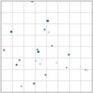
The Matplotlib documentation gives an example of a scatter plot with random data:
import matplotlib.pyplot as plt
import numpy as np

plt.style.use('_mpl-gallery')

# make the data
np.random.seed(3)
x = 4 + np.random.normal(0, 2, 24)
y = 4 + np.random.normal(0, 2, len(x))
# size and color:
sizes = np.random.uniform(15, 80, len(x))
colors = np.random.uniform(15, 80, len(x))

# plot
fig, ax = plt.subplots()

ax.scatter(x, y, s=sizes, c=colors, vmin=0, vmax=100)

ax.set(xlim=(0, 8), xticks=np.arange(1, 8),
       ylim=(0, 8), yticks=np.arange(1, 8))

plt.show()
It's my contention that this is needlessly bothersome, in that four lines of code are wasted in created something that doesn't mean anything to anybody. The end product isn't all that amazing either.
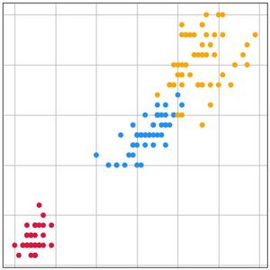
Here's what that looks like using the iris dataset.
import pandas as pd
import matplotlib.pyplot as plt

names = ['sepal_length', 'sepal_width', 'petal_length',
                'petal_width', 'species']
df = pd.read_csv('iris.data', names=names)

plt.style.use('_mpl-gallery')

fig, ax = plt.subplots()

colors = {"Iris-setosa": "crimson", "Iris-versicolor": "dodgerblue",
        "Iris-virginica": "orange"}

df['color'] = df['species'].map(colors)

ax.scatter(df['petal_length'], df['petal_width'], c=df['color'].values)

plt.show()
Nothing is saved in terms of lines of code - this example is longer than the original - but the extra length is of value, because where the data comes from is more understandable and it's easier to relate the final plot to our notion of the original data, not least the remarkable way the setosa species is distinguished from versicolor and virginica by its petal size.
Of course, this particular scatter plot documentation itself could use a little work, but that is work for another day.